Texture, Direction, Loud/ Quiet and Straight /Curved
by Ted Intorcio
I just finished reading The Envelope Manufacturer by Chris Oliveros; a dark comedy and winding-tale set in the ‘50s about a man, Jack Cluthers, struggling to keep his micro-manufacturing company from having to close its doors due to all the usual challenges a small business faces. The book is a good mixture of the surreal and reality with plenty of dark humor thrown in for good measure. Chris Oliveros has a keen sense of story and pacing and has created something which is, at times, somewhat abstract without falling into incoherence. The story is masterful, but not just because of the writing. Chris understands the importance of good design in telling a story. What is design? I’m sure that’s up for discussion but my definition would be “the arrangement of elements on the page employing formal principles and contrasts to motivate, enhance, refine and organize both the story, its visual interest, its flow and its emotional impact.” To be clear I’m not talking about the ability to draw anatomy, facial expressions, backgrounds, buildings or any other subject matter. I’m talking about principles like repetition, direction, texture, space, anomaly, concentration/radiation, color, paired with contrasts like big/small, black/white, hard/soft, straight/curved, expanded/condensed, simple/detailed and so on. The director of photography in any movie of substance is well aware of these rules of design when framing a shot. So too should the comic artist. The power in identifying a design principle and exploiting it is in connecting with the reader. When a design is effective, it visually emphasizes the intended mood and story with as much power as words in literature, but using the language of abstract form. I’ll use The Envelope Manufacturer as my example. Page 58 is a good place to start. 
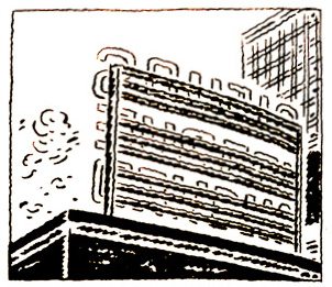
Here we see a series of panels showing the exterior of the town in which the factory is located. From a design point of view the first thing you may notice are the dots and dashes Chris uses to create detail for the bricks, grass, clouds, floor. It’s an obvious use of Texture (Design Principle) to create visual interest. He has paired this principle with a quiet/loud (contrast) leaving some areas clear, giving the eye a much needed rest. The page has an organization about it but it also communicates the busy, cluttered nature of the setting. The power in contrast is its ability to exaggerate the visual characteristics of things that our eye compares. It serves to make the story more “readable” through the emphasis the contrast creates.
The principle of “direction” is employed in this next example, page 76.
This page uses the curving stems of the word balloons to lead our eye in a winding fashion from one frame to the next. These round lines are contrasted with the strong vertical and horizontal lines in the scenery and panel borders, Creating an organized, simplified and more coherent visual message. When employing principles and contrasts, it’s important not to add more than one or two of each for any given page. Using more can dilute the composition with competing graphic devices and causes confusion. I’ll try to find an example where that’s apparent for next time.
Look for more posts to further explain the use of good design to tell a story. This is a vast subject and one not likely to be fully explored in a blog post. I’ll return to this subject for future posts using varying examples that illustrate what I’m talking about. In the meantime, pick up a book that may give you more insight. Below are links to a couple of suggestions.